Viltrum: A Bold Display Typeface for Web Designers
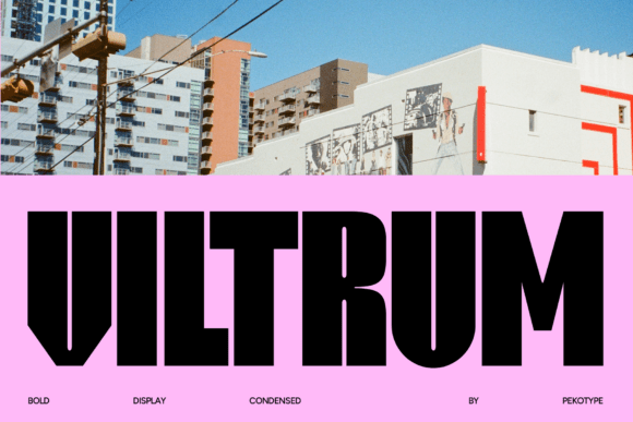
When you are building a digital experience, the first thing a visitor registers is not the layout or the color scheme—it is the typography. The font you choose for your headers, hero sections, and call-to-action buttons sets the tone before a single word is read. That is why I am always on the lookout for typefaces that can stand up to the demands of modern web design without feeling generic or overused. Viltrum is one of those fonts. It is a bold, all-caps, condensed display font that brings a distinct energy to every screen it appears on. With thick strokes, a compact letterform, and an unmistakable presence, Viltrum is built for projects that need to make a statement from the first pixel.
What Viltrum Brings to the Digital Table
Viltrum is not a subtle font, nor should it be. It belongs to the display category, which means it is designed to grab attention rather than fade into the background. The condensed nature of the typeface allows you to fit more visual weight into a smaller horizontal space, making it ideal for headlines where every character counts. The all-caps styling reinforces a sense of authority and directness, while the thick strokes ensure that the text remains legible even at smaller sizes or when placed over busy backgrounds. In a digital landscape where users scan rather than read, Viltrum helps you control exactly where the eye lands first.
From a design perspective, Viltrum carries a modern, almost industrial feel. It is not a serif font, not a sans serif font in the traditional sense, and certainly not a script font or handwritten font. It is a purpose-built creative font for contexts where you need boldness and brevity. Whether you are working on a landing page for a SaaS product, a hero section for a boutique online store, or a set of social media graphics for a brand launch, Viltrum gives you a consistent visual anchor that feels both premium and approachable.
Using Viltrum in Website Headers and Hero Sections
The most natural place to deploy Viltrum is in your website headers and hero sections. These are the areas where users form their first impression, and a strong typeface can make the difference between a bounce and a click. When I use Viltrum in a hero headline, I pair it with a simple sans serif font for the supporting body copy. The contrast between the dense, all-caps display font and a lighter, more spacious sans serif creates a clear visual hierarchy. Users immediately understand that the headline is the primary message, and the subtext is secondary but still important.
For example, on a product landing page for a digital tool, Viltrum can carry the core value proposition in just a few words: "BUILD FASTER. SHIP SMARTER." The condensed letterforms keep the line length manageable, even on desktop screens, and the bold weight ensures that the text stands out against a dark background or an image overlay. On mobile, the same headline scales down without losing its impact, because the thick strokes retain their clarity even at smaller viewport sizes.
Visual Hierarchy and Scanning Behavior
One of the biggest challenges in web design is guiding the user's eye through the content in a logical order. Viltrum helps with that by creating a strong punctuation point in your layout. Because it is a display font, it naturally draws the eye first. When you place it in a section heading, a call-to-action button, or a short promotional banner, users will register that element before anything else on the page. This is incredibly useful for conversion-focused layouts where you want the user to take a specific action, such as signing up, purchasing, or clicking through to another page.
I have found that Viltrum works particularly well for online store banners and promotional tiles. A phrase like "50% OFF TODAY ONLY" in Viltrum creates urgency and authority at the same time. The all-caps styling reinforces the directness of the offer, while the condensed letterforms allow the entire message to fit within a single line, even on smaller screens. This reduces the cognitive load on the user, because they can process the entire offer at a glance rather than reading multiple lines of text.
Practical Applications Across Digital Projects
Viltrum is versatile enough to appear in a variety of digital contexts, but it is important to use it deliberately. Here are some of the scenarios where I have found it to be most effective:
- Creative portfolio sites: Use Viltrum for the main navigation headings and project titles. The bold, condensed style gives the portfolio a confident, professional edge without distracting from the work itself.
- Boutique online stores: Place Viltrum on category headers, sale banners, and product badges. It helps the store feel curated and premium, especially when paired with clean product photography and a neutral color palette.
- Coaching or consulting websites: A headline like "TRANSFORM YOUR CAREER" in Viltrum immediately communicates the value of the service. The directness of the typeface aligns well with coaching and personal development brands.
- Product landing pages: Use Viltrum for the hero headline and the primary call-to-action button text. The consistency between the headline and the CTA reinforces the message and encourages action.
- Course sales pages: Viltrum works well for module titles, pricing tables, and limited-time offers. The condensed letterforms help fit more information into a compact layout without feeling crowded.
- Blog headers and content sections: While Viltrum is not suitable for body text, it makes an excellent choice for blog post titles, pull quotes, and section dividers. It adds a layer of editorial polish to content-heavy pages.
- Digital brand kits: If you are building a brand identity for a client, Viltrum can serve as the display font for logo treatments, taglines, and brand collateral. Its distinctive look helps the brand feel memorable and cohesive.
Readability Considerations for Mobile and Responsive Layouts
Because Viltrum is a condensed display font, it requires careful handling on mobile screens. The thick strokes and tight letter spacing can become difficult to read if the font size is too small or if the background is too busy. I recommend using Viltrum at a minimum font size of around 24 pixels on mobile devices, and increasing that to 36 pixels or more on desktop. This ensures that the letterforms remain crisp and the spacing does not feel cramped.
When placing Viltrum over images, always add a dark or light overlay to maintain contrast. A semi-transparent background behind the text can also help with legibility, especially on hero sections where the background image changes at different breakpoints. On dark backgrounds, Viltrum performs exceptionally well because the thick strokes create a strong silhouette against the dark canvas. On light backgrounds, the font retains its boldness without feeling harsh, provided you choose a complementary color palette.
For buttons and small UI elements, use Viltrum sparingly. It works well for primary action buttons where the text is just one or two words, such as "SIGN UP" or "BUY NOW." For longer button text, consider a simpler sans serif font to avoid readability issues at small sizes. The key is to use Viltrum where impact matters most, and let other fonts handle the heavy lifting of body copy and secondary information.
Font Pairing for a Cohesive Digital Identity
No display font works in isolation, and Viltrum is no exception. The best way to use Viltrum in a web design project is to pair it with a clean, neutral sans serif font for body text, navigation, and secondary headings. The contrast between the bold, condensed display font and a lighter, more spacious sans serif creates a balanced rhythm that feels both dynamic and professional.
For a more editorial digital identity, you could pair Viltrum with a serif font for the body copy. The combination of a bold display font and a refined serif font gives the site a sophisticated, magazine-like feel. This works particularly well for portfolio sites, online magazines, and brand storytelling pages. If you are going for a minimalist or tech-forward look, a sans serif companion is the safer choice. Keep the pairing simple—one display font and one body font is usually enough to maintain a consistent visual identity without creating visual clutter.
When selecting a pairing font, look for one that has a similar x-height to Viltrum, so the transition between the two typefaces feels natural. Avoid pairing Viltrum with another display font, as that can lead to competition for attention and a confusing hierarchy. The display font should be the star, and the body font should support it without drawing attention away.
Technical Considerations for Web Use
Before committing to Viltrum for a client project or your own website, check the file formats and licensing options. For web use, you will typically need WOFF and WOFF2 formats to ensure compatibility across all modern browsers. If you are using Viltrum in a digital product like a template or a landing page builder, confirm that the license covers that specific use case. Commercial font licensing for websites, online stores, and client projects is standard, but always read the terms carefully to avoid any issues down the line.
If the font includes alternates, ligatures, or multiple weights, take advantage of those features to add variety to your headers and section titles. Some display fonts also offer language support for accented characters, which is essential if your audience includes multilingual users. Check the character set before you start designing, especially if your content includes non-English words or names.
Building a Consistent Brand Identity with Viltrum
Consistency is the hallmark of a strong digital brand, and Viltrum can help you achieve that by providing a recognizable typographic anchor across all touchpoints. Whether you are designing a website, a set of social media graphics, a product landing page, or a digital ad, using Viltrum for the same type of content—headlines, call-to-action text, and short promotional phrases—creates a sense of continuity that users will subconsciously register.
For example, if you use Viltrum for the hero headline on your homepage, use it again for the main heading on your product pages, your landing pages, and your email headers. The repetition reinforces the brand identity and makes the font feel like an integral part of the brand rather than a one-off design choice. Over time, users will associate the bold, condensed style with your brand, which builds trust and recognition.
Viltrum is also a strong candidate for logo text or tagline applications. If your brand name is short and punchy, setting it in Viltrum gives it a distinctive, memorable look that stands out in a crowded market. Just be mindful of the all-caps nature—if your brand name is longer than a few syllables, the condensed letterforms might make it difficult to read at small sizes. Test the logo treatment at various scales before finalizing it.
In the end, Viltrum is a tool, and like any tool, its effectiveness depends on how you use it. When applied with intention, it can elevate a digital project from ordinary to memorable. It is not a font for every occasion, but for the occasions that call for boldness, clarity, and a touch of modern authority, Viltrum delivers exactly what a web designer needs.